Monday, July 22, 2013

GURPS Calculator 2.2.4 Released (Old Android App)

--Edit--

This post is no longer relevant as it pertains to the now defunct android app which was removed from the app store.

I've been researching working on version 2.3 for awhile now and trying to puzzle out the best ways to use the Android Listview components to redo the tracker, when a user brought up in a review that the calculator is woefully lacking in landscape mode. Remembering the promises I made of creating landscape screens almost two years ago when I first release the calculator (and desperately needing a break from the enigma of the listview), I started work on 2.2.4, which quickly went from creating simple landscape screens to a redesign of portrait screens as well.


Most of the screens are very simple, and could suffice with the new label orientation (on top of the text inputs as opposed to next to them, which gave a lot more breathing room to the design), but the combat calculator actually threw me for a bit of a loop. I finally settled on a two column approach with the readout on the right side.

Combat Calculator, Landscape
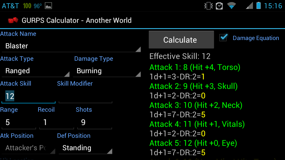
The new combat calculator, landscape orientation.

While working on the screens, it was suggested that hit location penalties should display immediately next to the labels in the dropdown for easy reference. The idea was so simple and elegant that I couldn't avoid doing it. During live alpha testing it helped so much that I couldn't believe it wasn't a feature from the start.

Next up was addressing a random hit location bug introduced in 2.2.3, where a penalty would display for a random hit when it should not (random hit locations never incur penalties). Thankfully it was visual only, the penalty was not actually being applied. It was confusing enough to users that I fixed it for this release.

The last bug I stumbled on during alpha and was so embarrassed that I had to fix it for this release. If a ranged attacked with ROF >1 and attack skill >16 rolled a natural 17, the readout informed the user that the first attacked missed (17 is always a miss) but if the recoil was low enough and the skill high enough the second attack might say it hit. Of course if the first attack missed they are all supposed to miss. This bug did not involve critical hits, that already worked as designed.

I've switched gears back to 2.3 now, trying my best to come up with a solid design and implementation of the listview to further enhance the tracker.

GURPS Calculator 2.2.4

Friday, January 25, 2013

jQuery - iterating on every nth object in a collection

In jQuery it is often necessary to iterate over a collection to manipulate multiple objects. A common mistake when doing so is to iterate over every object when it is not needed.

For example, let's say I have an unordered list where the 5th item in each list needs a CSS class added to it. A common way to do this would be like so:

This will iterate over the entire collection of list-items and track the iterations in i. It will compare each iteration of i to modulus 5, and if this is a iteration that has a modulus 5 of 0, then add the CSS class.

Now take for example the power of nth-child selectors.

With one line we accomplish exactly the same result, but with very few operations. It is important here to note that I used "5n" and not "5". Simply using "5" would only bold the 5th li in every ul affected, while "5n" will add the class to each multiple of 5 in all ul's affected.

Wednesday, January 23, 2013

Styling HTML Selects (Dropdown Hack)

One of the top gripes I have with current web standards is an almost complete lack of support for styling HTML selects with anything other than a few colors or size modifications in IE or Firefox.

Recently, I had a project where I wanted a fresh look to all my input forms, making them appear as single gray lines like you would find on a pen-and-paper form.


Here is the initial set up for the project:
With initial styling, we end up with this:

Chrome
IE
Firefox
Looking good! In fact, it will be perfect if we can just get rid of that darn down arrow to make the inputs look identical!

In chrome, this is a simple matter of adding one line to our flat class: -webkit-appearance: none

This line will tell any webkit browser to ignore the default styling they usually apply to controls and instead use the one I've defined. For selects, this has the effect of completely removing the dropdown arrow, leaving me with exactly what I want:
Chrome with -webkit-appearance:none

However, this does not address IE and Firefox, neither of which are webkit. Unfortunately, there is no way to simply style away the down arrow in these two browsers. So, what now? This is where things get annoying. In a perfect world, there would be a selector for all browsers such as chrome has, but because there is not, you might as well not even use it in chrome, since this hack for Firefox and IE will do the trick in chrome as well.

First we need to alter the markup. 


...and the css...


The select itself needs to go inside of a span. This span will have overflow:hidden, and a width smaller than the width of the select. This means the the down arrow is still technically there, but is running off the right edge of the span and is thus invisible to the user. We will also set the container span's height to something smaller than the height of the select, so that the top border of the select is now invisible. This is because IE7 is a pain in the butt and likes to ignore "border: none" on select objects.

Manipulating the padding and margins around a bit, and adjusting width as needed, gives us a way to have consistent select of any style or, in my case, a boring gray line that I think looks awesome.


The last three lines are dropdowns!
Gregor the Bold, rides again! kye yah!


Final Code